
First entry and grand opening of this website! Not even sure if I can call this a grand opening since I have like 3-5 pages not even done-
I was so indecisive when it came to the colors of this site. I was planning on making it brown and purple first, since purple is the main color of my other website. But I didn't like how it was coming out. I was just going through random neocites pages, then I found a shrine page someone made for 'The boiler', a Toontown's boss I think. Their page was the based on the color pallet and the design of the boss. Then I thought, maybe I'll design the website based on the UI of the game. That was my final decision, I took screenshots, looked through the Fandom wiki pages, and got to work.
I've only built a semi-decent website in Winter for a finals project in 1 week, and it was with the table. So this website was a huge jump for me coding-wise.
It was while I was building this website, I found out that SadGirlOnline's website went offline and was archived. The generator was still up in her codepen, but
I wanted to at least try to build mostly from scratch, if I really got stuck, I would just look through stackoverflow for help- I used some of the CSS code of the template as a reference and the mobile-view code, I wasn't fully sure how the website
will look. This is the first time building with a flexbox, grid layout, and orders. I wanted to add JavaScript to the website, but I don't have the money for the
supporter tier, so this website is just HTML and CSS. There's like 2 tiny snips of Javascript, but it's attached to HTML. I was panicking a little bit because
I wasn't sure how I was going to do the gallery/archive sections because I can't do the lightbox code. Buttttt the tree-view code worked better than I thought, and
adding display:grid; helped a lot. This could've been way better with JavaScript, but I'm honestly proud with how this turned out. This took me 54 days to complete.
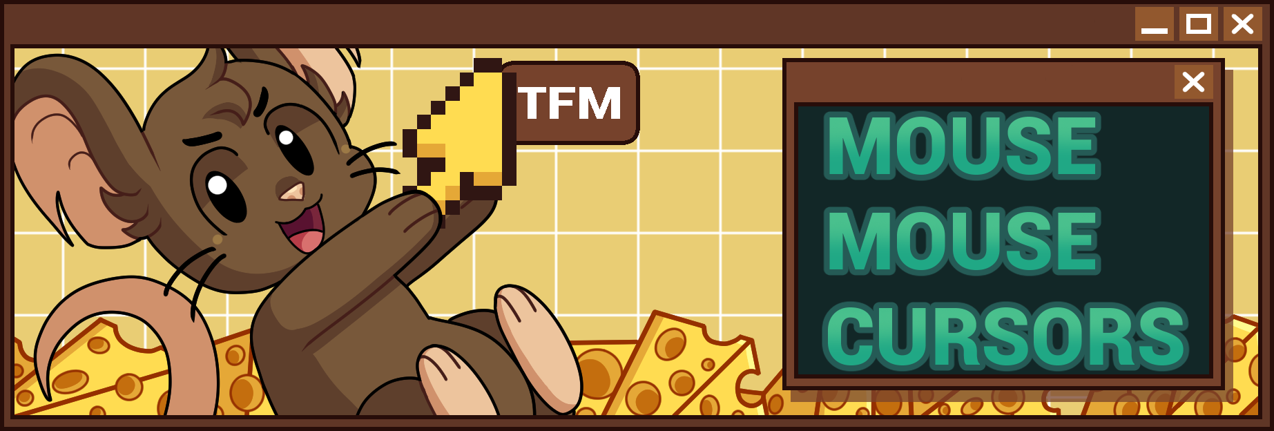
Hardest pages to do was the 'Cursors' and 'About Me'. I knew the 'About Me' page was going to take the longest because of the layout, so I saved it for last.
'Cursors' page is what helped me with doing the grid layout inside of a container and column span. But DAMN the item CSS took me a while to figure out. The issue
I was having was trying to add the collector's tag while keeping the table cell the same height. Found it's not really possible, so I just removed the tag.
The 'About Me' page, my main issue was the TFM header with my username. I really didn't want to use the absolute for position because I wanted to try and make this at least semi viewable on mobile, and float wasn't working for me.
I kept looking up possible solutions, I found that grid-template-rows could possibly work. I still am confused about the input values, all I know is, I got the layout row
I wanted, then adjust the positions for my mouse and the profile header.
I wanted to add a tag filter for the cursors but, I thought that would only be possible with JavaScript. Found out it IS possible, you just have to use the ids in the radio as a class for the element.
I also struggled with this one because I was trying to get it to work with the cursors as a table. It wasn't working so I changed the code as an unordered list, but that still wasn't working. I looked at several
examples from others, I knew you had to use the :has(input[]:checked + element), I was still doing something wrong. Problem was, I added the wrong descendant and the tags weren't together with the
list. After that fixed both, it started working. Then I ran into another issue with the tab focus, since it wasn't working. Issue was I used display:none; on the radios, opacity: 0;
position: absolute; brought it back.
At least I learn about using flexboxes, grids, and mobile-viewing. Also learned at CSS can do JS like code(to a certain degree). I do want to try adding aria-labels to this website later in the future.
Thanks for reading if you made it this far!◝(ᵔᗜᵔ)◜